Using Landing Pages For Lead Generation (Our Exact Strategy!)
Do you have an event you’re trying to promote?
Perhaps you have a new condo building opening or a pre-sale event you want to draw awareness to.
Maybe you want to build a highly targeted database of contacts (so you can turn those contacts into leads and those leads into sales.)
It can be hard to know where to start.
Where do you find these potential leads?
We’re going to share with you a highly effective strategy we’ve used here at Primal digital agency bangkok with our clients who have faced the exact same problem.
It starts with smart-targeting. We’re going to create a funnel that brings the leads to you instead of the other way around.
We’ll break down how we create landing pages for real estate and examples of designs that result in high conversions.
Table of Contents
Here’s what a great Lead Generation strategy can do:
1. Condo presale event in Sukhumvit, Bangkok: 76% Units sold and 35% of attendees came from campaign
2. Condo presale event in Ekkamai, Bangkok: Increased enquiries with a 5% click through rate and generated a targeted database of 513 leads
3. Awareness for a property: Increased leads by 4x with a 4.26% conversion rate from Adwords
In this 2-part guide, we’re going to show you step-by-step:
• How we use landing pages to generate leads
• The anatomy of the perfect landing page that converts
• The exact channels we use to find and drive relevant traffic (Pt.2)
• How to setup and optimise marketing channels to increase conversion rates (Pt.2)
Using Landing Pages In Your Lead Generation Funnel
Firstly,
What is a Landing Page?
Landing pages can be in different forms to meet different objectives. Such as squeeze pages and click-through pages.
A general definition is:
“A standalone web page distinct from your main website that has been designed for a single focused objective.” – Unbounce.com
For our guide, we’ll be referring to lead generation landing pages. That is, landing pages designed for lead captures. Gathering user information like their name and email so that you can market to them at a later stage.
So, how do the creation of landing pages help you generate leads:
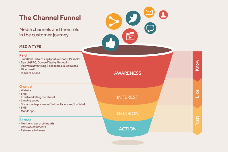
It all starts with looking at how users make buying decisions.
It comes down to the good old advertising model of AIDA.
That is Awareness, Interest, Decision and Action.
Think of it like a bucket. A bucket that needs filling with leads.
We want to get these leads into the top of the bucket (the Awareness stage).
With, landing pages sitting in the Interest stage. That’s where you will gain their interest and convert them to leads.
But hold on, how are these visitors going to know your landing page exists?
That’s where multi-channel digital marketing comes in. That is, marketing across different channels like:
• Google Adwords Bangkok
• Facebook Ads/Facebook Brand Awareness
• Youtube Ads
• Instagram Ads
• Videos ads
• .. and many more
For our lead generation campaign, we want to look at perfecting the different touch points (or ways a potential visitor will come in contact with our brand).
What that looks like:
• Who are our people: What do our potential customers look like?Is it the young couple working office jobs looking for their first condo? Or is the middle aged hospital worker looking to buy a second holiday home?
• Where do they hang out: What digital marketing channels are our “people” on? Now that we know who they are, we can narrow it down to picking the most efficient ROI channels and exposing our marketing to the right people.
• How are we going to appeal to them: We know where they are. Now it’s about creating a campaign that’s going to get them to want to take action. You wouldn’t speak to a 50-year-old man the same as a 20-year-old woman. They’re also not going to have the same needs and wants. We take all of that into consideration. What types of ads might we create and what type of language and imagery are we going to use?
Look at how different, these two landing pages for real estate listings are. If we swapped the audiences for each page, how do you think the conversions would look like?
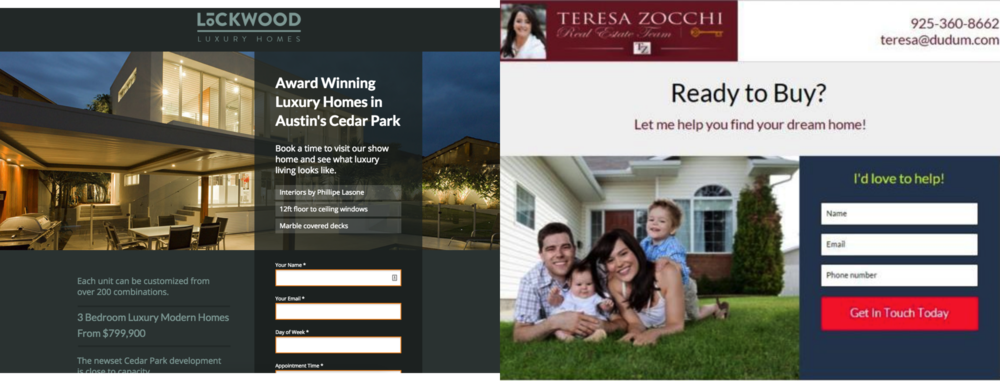
Luxury vs Family Friendly. – Source
• What actions do we want them to take: This is where your landing page comes in. If you’ve done the work, the next step is where you are going to send them and what do you want them to do. Do you want them to fill out their email to be notified about your event or entice them to sign up early and receive a bonus on their purchase?
• Craft your landing page: Your landing page will need to think about where the user is in the journey or funnel and how you’ll optimise the page to get them to take action.
Creating Your Perfect Landing Page Template
Without a good net, you’re not going to catch any fish.
A bad landing page is like having a hole in your net. You might do all the work of casting out your net, attracting the fish but eventually they’ll slip out through the hole.
Crafting a conversion-focused landing page design is the cherry on top of your marketing campaigns.
You’ll attract the right people, and if done correctly, they should engage with your landing page.
So the first thing you need to do when setting up your lead generation campaign is choosing how you’re going to construct your landing page and landing page best practices.
Before you might have had to hire a website designer and developer to create one for you. These days, there are many platforms that make it easy to design and implement a landing page.
Different platforms varying on cost, customisation and availability of tools.
Here are just some of the landing page options available:
• Leadpages.com
• Unbounce.com
• Instapage.com
• ThriveThemes.com
• ConvertKit.com
You can also buy individual landing page templates, but we suggest going with a platform that will support the full functionality of your campaign.
Even better, let Primal help run an end to end lead generation campaign for you. We create a perfectly optimised landing page, expose the right people to your brand and drive targeted warm leads to you for you to convert to sales.
We’ve tried out a few of these platforms, but when it comes to choosing the right one for you, it really comes down to what you need.
With some of these platforms costing $50 per month, you want to think about if your investment suits the capability you need from it.
The Anatomy Of A Perfect Landing Page
A perfect landing page should have the user saying “YES, give it to me!”
Why is that?
A great landing page is like trying on the perfect outfit recommended by a salesperson. It fits your style, taste and needs.
What makes it more appealing? If the dressing room has great lighting and no distractions.
It’s an easy decision, this looks great, it’s exactly what i want. I’m in!
A great landing page should achieve the same thing. It doesn’t confuse the user – it states the benefits and value in an appealing way that drives them to take action.
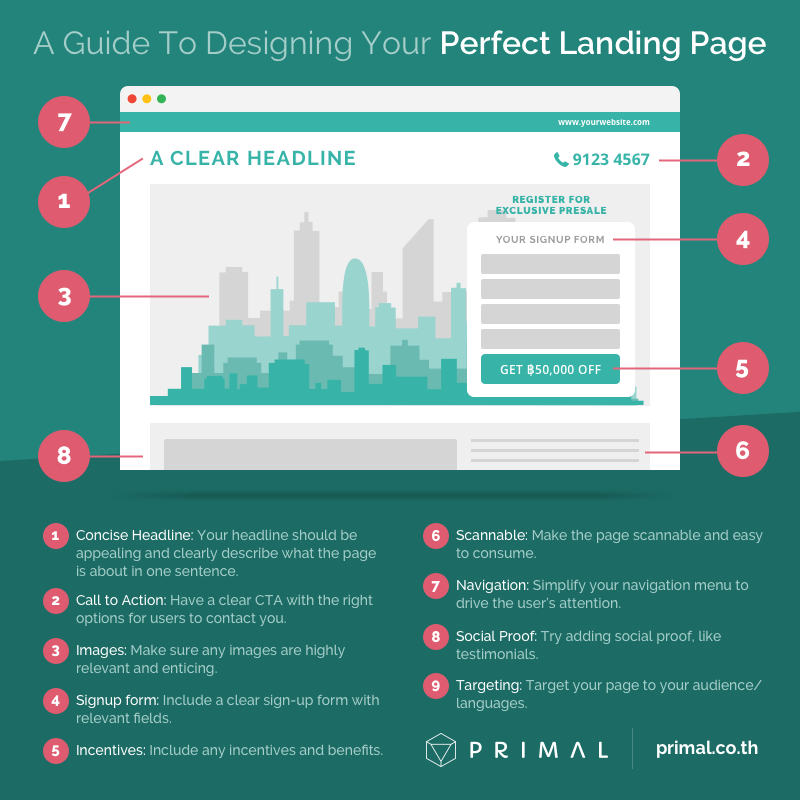
Here’s our guide to best practices for creating your landing page designs:
Save me for later
1. Concise Headline
A great headline should do two things:
1. Tell you exactly what the page is about
2. Grab your attention
You want to make it easy for the user to know exactly why they’ve landed on your page. In an appealing way.
Take the two examples below:
“Find Your Dream Home” and “Your New Home Your New Life”
They convey the message that you’re going to find a home (need) but sell it to you with mentions of “dream” and “new life”, which brings images of finding the right home for you (want).
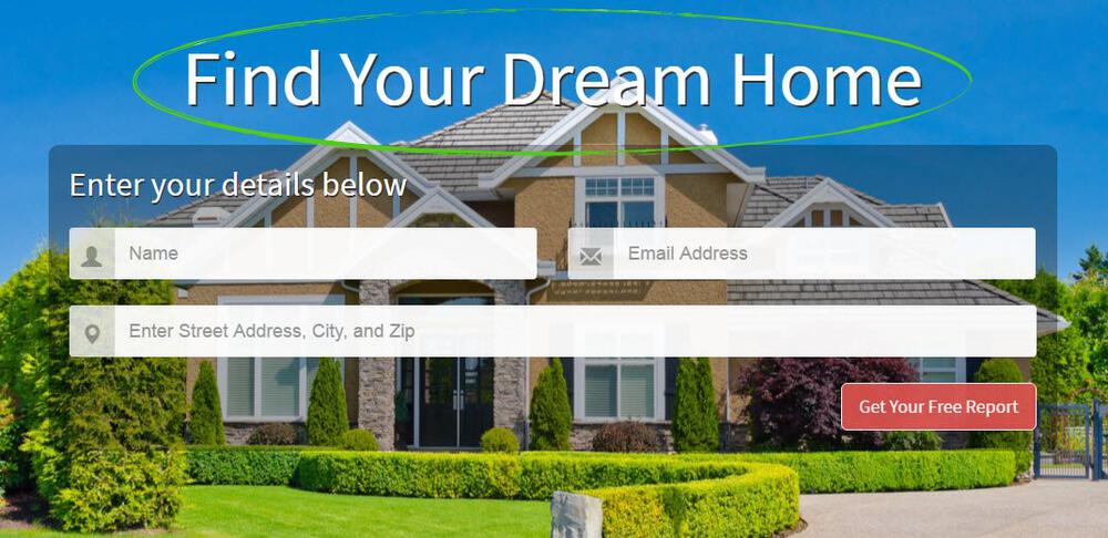
“Find Your Dream Home”
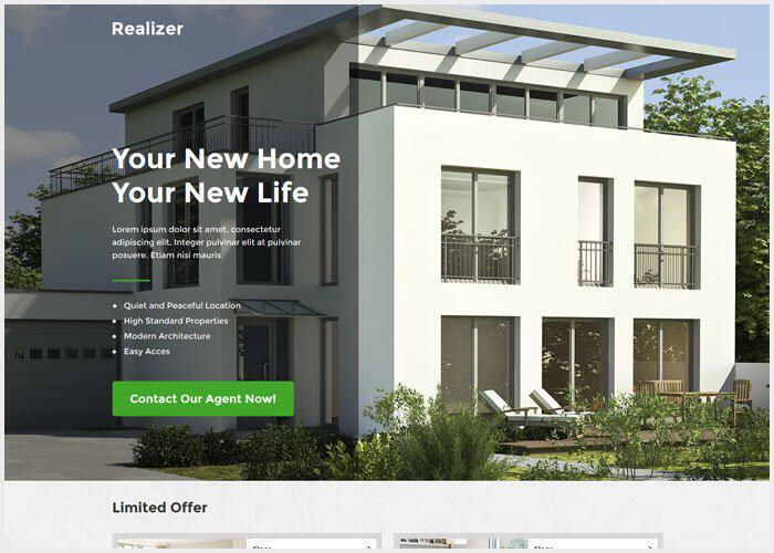
“Your New Home Your New Life”
2. Call to Action
Create your page with the idea in mind: What’s the one action you want them to take?
For 99% of landing pages, it’s going to be filling out the signup form.
But you also want to make it easy to contact the company.
How are users going to contact you?
Make sure you have clear contact information in a clear place.
That might be a large bolded phone number in the top right hand corner with the website listed somewhere on the page.
Your signup form button is actionable with an included discount, benefit or value.
You want to make it as simple as possible to complete the desired action.
The action should be the central focus on the page (in this example, it would be entering in information into the signup form.)
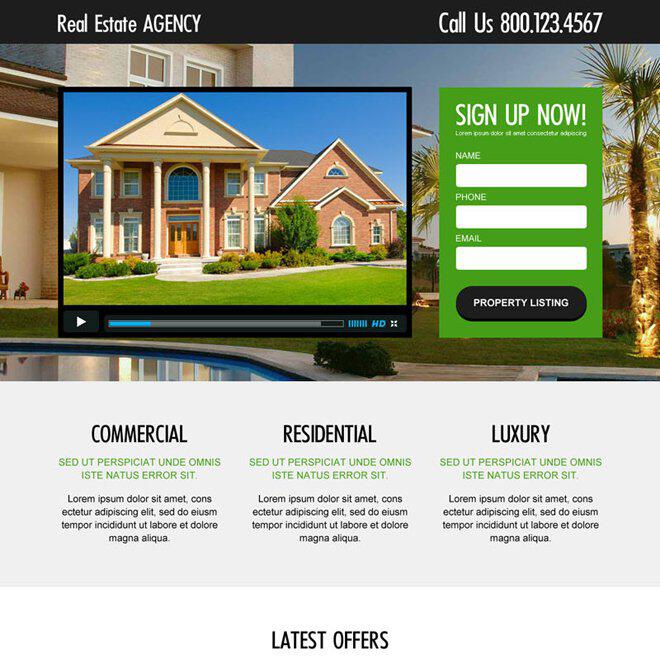
3. Relevant Images
People are visual beings.
We can scan a page in a matter of microseconds. In fact, one of the first things that will grab our attention before a headline is the imagery.
Your images should be relevant and appealing.

One of our template banners. Stylish visual image of the condo building
If you’re advertising an opening to a pre-sale event at a condo, it would make sense to put a beautiful photo of the condo or area.
Similarly, you should be considering who’s looking at the images.
If the condo in the building are all 35sqm, and for single people they’re going to have different needs than a luxury condominium with full sky garden and pool facilities.
What are the priorities of someone looking to live in a safe area vs. someone who wants stylish living spaces?
4. Signup Form
People don’t typically like taking a lot of actions online.
Why do you think when Amazon implemented their 1-click payment system they saw sales rise?
Why do you think many websites utilise the Facebook sign up feature instead of getting users to create a new profile?
We are creatures of comfort who are easily distracted.
The more fields you give them to enter, the higher a chance they’ll drop off.
With the best landing pages for real estate, you have to find a balance between the information you need from the potential lead and the tradeoff to simplify the process. Usually the more desirable the offer, the more fields you can get away with.
Offering a 50,000 THB discount off the sale of a new condo just for signing up to the event?
That will help entice users to complete the action.
Start with the must have information:
1. First Name, Last Name
2. Contact Information (Email and/or Phone Number)
All the rest are optional and up to you to weigh up the importance to your overall campaign. Some examples for a presale condo campaign might be:
1. Age range
2. Job Title/Description
3. Type of Condo (1 bed, 2 bed etc)
4. Address
5. Budget
6. Reason for purchase
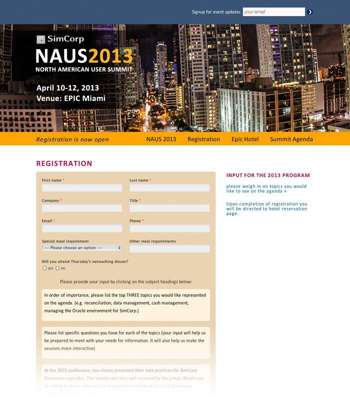
Does this look enticing to fill in or intimidating?
5. Incentives
A valuable offer will help drive action.
Offer them something they genuinely want.
For example, if someone was looking for a new gym in the area, you might offer them a one month free trial. It gives them something that is relevant to them.
6. Scannable
Follow KISS.
That is, Keep It Simple Silly.
What does that mean in terms of landing pages?
Don’t overwhelm your visitors. Break the page up with bullet points or sections and only include what adds value and needs to be there.
7. Navigation
One of the most effective and underlooked areas of landing pages is the no-navigation bar.
Why?
We want users to take action. By giving them options, you’re increasing distraction and the chance they’ll click away.
Why would you give them a reason to leave your page. Don’t do that!
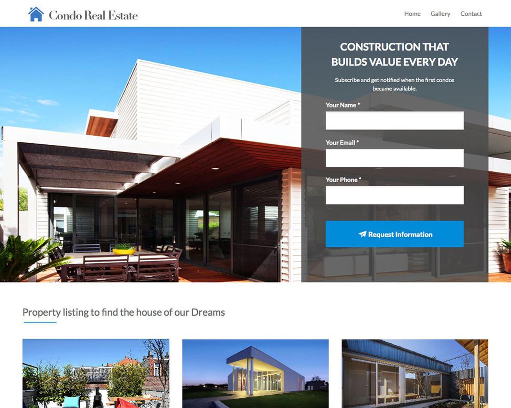
Why are you giving them reasons to click away from your page before driving their attention to filling in their information?
8. Social Proof
Depending on the type of campaign you’re running, social proof such as written or video testimonials could be a useful element.
9. Targeting
We’ve already established the more relevant your page to your users wants and needs the higher the chance of them converting.
Things like segmentation or language targeting should all be taken into consideration with your campaign.
Will you have potential buyers who are local Thais and foreign expats?
You might need to have an English and Thai landing page, or both English and Thai language on your real estate landing page.
Testing & Optimising Your Landing Page
Once your landing page design is up and you’re driving traffic to it, you should still continue to test and refine.
The assumptions you’ve made during the creation stage might prove to be wrong.
You might think that a potential condo owner is interested in the building’s amenities when actually their #1 need is modern design in the apartment.
These small tests could be the difference between tens of thousands of sales.
A/B Testing Your Landing Page Creation
A/B testing or split testing is a science.
You want to make sure you’re making the right changes to get the right data for the right results.
There’s no point changing just the colour of the CTA button or making the mistake of making too many changes.
The way A/B testing works is, let’s say you expose your page to 2000 people
1. First 1000 see the offer for 50,000THB off the presale price of the condo
2. Second 1000 see the offer for first round exclusive event to buy
If we see on the first offer that 20% of users convert to filling out the form,
The second offer shows 10% of users convert
We can deduct that the presale discount is more important to our target audience than being able to have first availability to buy the apartment of their choice.
Other areas to test:
• Offers
• Removing fields and simplifying your signup form
• Heat Mapping, seeing where users are clicking on the page and changing the location of elements
• Changing your CTA and testing different sales copy
• Test for different audiences
• Changing Headlines and copy
• Trying different imagery
Optimising Your Landing Page For Mobile
Lastly, you need to make sure your landing page is optimised for mobile traffic. With smaller screen real estate and shorter attention spans, you need to deliver the same impact in compact form:
• Remove unnecessary space
• Think about scrolling cues or if you can minimise scrolling
• Shorten your forms
• Minimise effort with strategic button placement
In part 2, we’ll cover:
• Driving traffic to your landing page
• Determining which traffic channels to use
• Using Facebook ads to drive leads
We’ll be diving deeper into the traffic strategy of lead generation for lead capture landing pages. We’ll cover the exact channels we use and results we’ve seen for our clients successful campaigns.
Keep an eye out for Part 2, in the meantime – download our free landing page templates (and the exact ones we’ve used to drive leads for our clients) with the pop-up on the bottom right of this page.











Join the discussion - 0 Comment